

fig2
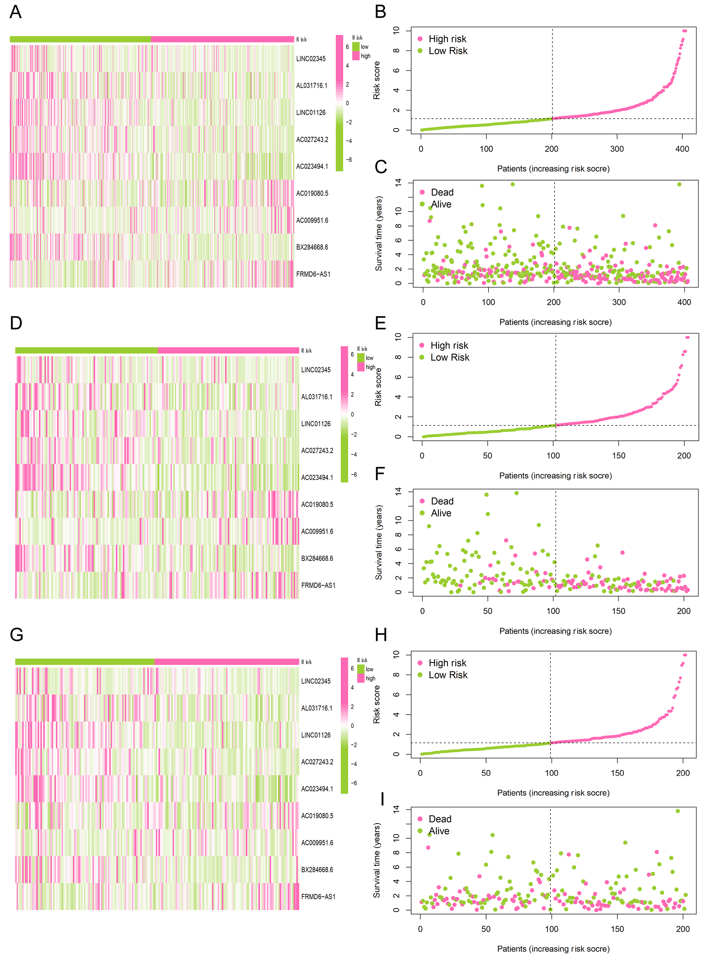
Figure 2. Visualization of gene expression, risk score, and survival status for risk groups. (A, D, G) Heatmaps illustrating the hierarchical clustering of migrasome-associated lncRNAs across both high-risk and low-risk cohorts; (B, E, H) Ranking and distribution profiles of the risk scores for participants in the two risk categories; (C, F, I) Scatter plots depicting the survival duration and current status of patients within the high-risk vs. low-risk subgroups.