


fig3
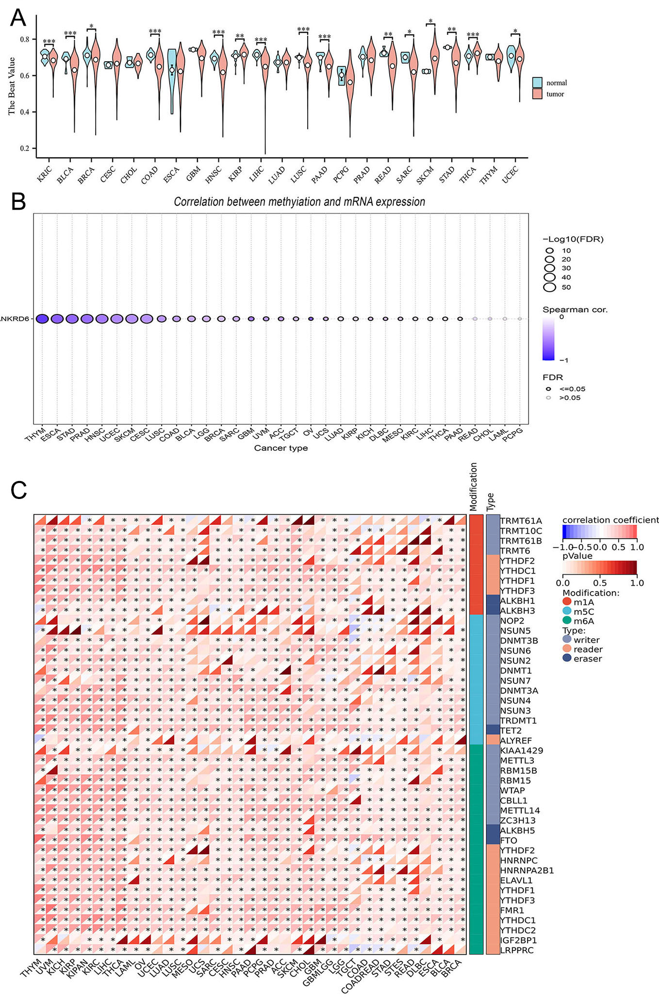
Figure 3. ANKRD6 DNA methylation and its correlation with RNA modification genes. (A) Analysis of differential ANKRD6 methylation patterns between malignant and adjacent normal tissues across diverse cancer cohorts. (B) Distribution plot showing the correlation between ANKRD6 methylation levels and mRNA expression across various cancer types. The x-axis represents cancer types, and the y-axis represents the gene symbol ANKRD6. The color scale indicates the Spearman Correlation coefficient (range: -1 to 1), with deeper colors representing stronger correlations. Bubble size is scaled by -log10(FDR). Significant correlations are highlighted by filled circles (FDR ≤ 0.05), whereas non-significant correlations are shown as hollow circles (FDR > 0.05). (C) Heatmap showing the correlation of ANKRD6 with RNA modification regulators (m1A, m5C, m6A). Red and blue colors denote positive and negative correlations, respectively, with color depth proportional to correlation strength. (ns: Not significant; *P < 0.05; **P < 0.01; ***P < 0.001).