

fig9
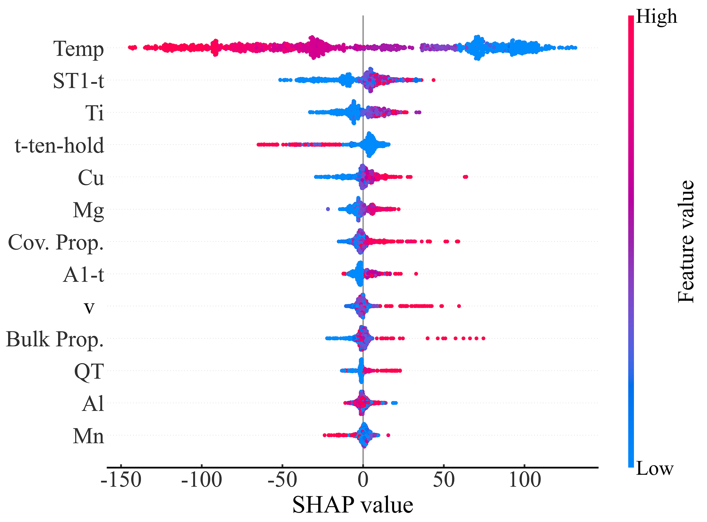
Figure 9. SHAP bee swarm plot (summary plot) obtained from the trained RF model. Each dot represents a sample in the dataset. The horizontal axis represents the corresponding SHAP value of the feature, where positive and negative values indicate positive and negative contributions to the UTS, respectively, and the absolute value reflects the magnitude of the contribution. The color of the dots represents the normalized feature value (blue for low values, red for high values). Features are ranked from top to bottom according to their mean absolute SHAP values (mean|SHAP|). SHAP: SHapley Additive exPlanations; RF: random forest; UTS: ultimate tensile strength.