

fig6
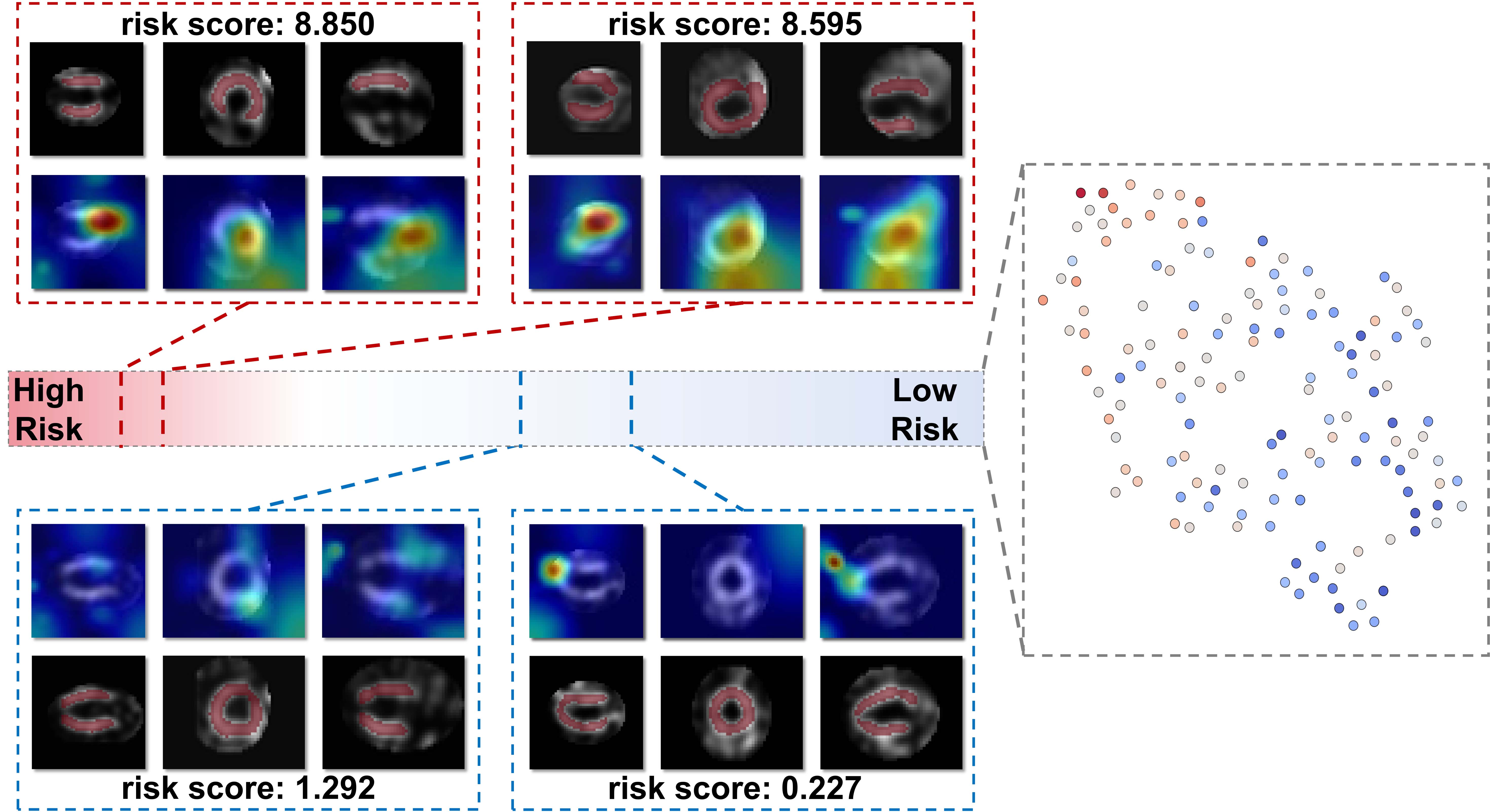
Figure 6. Visualization of risk stratification results and feature distribution. (Left) Representative cases from the high-risk (red dashed boxes) and low-risk (blue dashed boxes) groups. The top row of each panel shows the input images, whereas the bottom row displays the corresponding saliency maps or attention heatmaps, highlighting regions that contributed to the risk score. (Right) t-SNE visualization of feature embeddings in the test set, showing separation between risk levels.